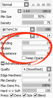
I’ve had a general idea what these things did but wasn’t completely sure what their specific functions were. I decided to sit down and figure it out, and I have thrown together a short reference guide for anyone who is confused about them. I know there are multiple translations of SAI floating around, so if some of these terms don’t sound familiar, just know that I’m talking about the three settings that appear under the texture in the brush tool settings (note that this won’t apply to any tool types except for brushesand watercolor brushes).
I don’t claim to be an expert so if you find I’ve made a mistake, let me know so I can update it, thanks! :3
—-
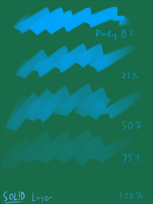
BLENDING (Color Blending)
This controls how readily the brush will inherit any colors you are painting over with it. For example, a 0% blending setting will pick up no existing colors, treating it as if you were painting on a transparent layer. A 100% blending setting will ONLY pick up existing colors (provided there are any). So at 100%, the color you’re using won’t even show up, unless you move to a transparent area. Blending is not affected by transparent pixels, so if you’re drawing on a blank layer it will have no effect.
So you can see from this example that the color I’m using gets harder to paint as the blending increases and more of the existing green is absorbed, until at 100% it is just completely turning green.
—-
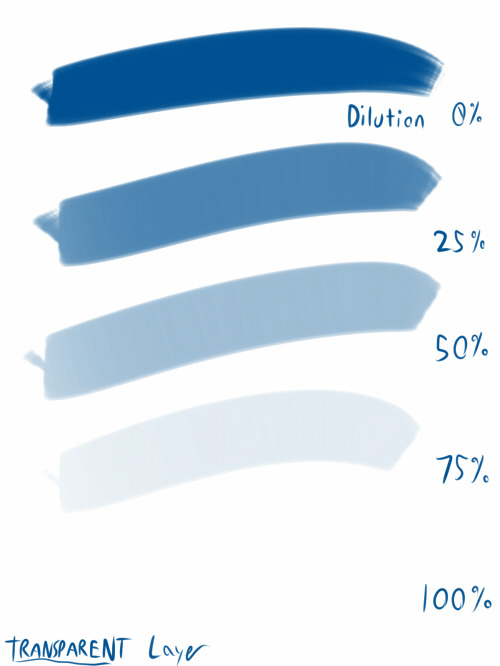
DILUTION (Opacity Mix)
This controls how readily the brush will draw on a blank (transparent) part of the layer. A 0% Dilution will result in the brush painting very easily onto a blank surface, while a brush with 100% dilution will literally not paint on blank parts of the layer at all. Dilution is ONLY affected by transparent pixels. So it won’t do anything if the whole layer is already filled in (even with white). Dilution can be thought of as the inverse of the Blending setting in some ways.
So in this example, you can see that as dilution approaches 100%, the color I’m painting with basically becomes invisible. In fact, if you were to switch to binary color mode and look at this layer, there would literally be nothing there anymore!
Keep this in mind – if you ever can’t paint for some reason, check your dilution setting, it might have gotten accidentally bumped to 100!
—-
PERSISTENCE
This one goes hand-in-hand with blending. Basically, it controls how easily a brush shifts color as you are blending from one color to another. Rather, how long it “persists” if you will. Like blending, Persistence is only really relevant when painting over existing color so it’s mostly unaffected by transparent pixels. Basically, the higher the persistence, the longer it will take for the color to shift as you make a stroke, and subsequently, from which color to which other color it is shifting is dependent on the blending setting.
So for this example I’ve done the same test with three different levels of blending. I turned off all pressure sensitivity (actually I just used my mouse) to emphasize the effects in a controlled environment:
If blending is at 0%, persistence fails to have any real effect. With pressure on, there is only the difference of having to push harder, but the results will be the same as far as I can tell.
At a happy medium of 50%, persistence increase causes the orange that the brush is picking up to last longer as it goes into the green, until it never shifts to blue at all.
At 100% blending, there was never any blue in the first place, because as we already know, full blending causes you to only pick up existing color. So the persistence setting changes only how fast the orange changes to green.
Persistence is dependent upon the blending settings, so having them somewhere in the middle will probably produce the most optimal results.
—-
CONCLUSION
Ultimately how you use these is up to you, and is largely dependent on what kind of brush you’re making and what it will be used for. And most of these settings are meant to be used together in unison, so play around with them a lot!
If you are confused, or not sure what settings you want or what settings you should be using, a safe bet is to put them all at about 50% – that will produce fairly average results that are easy to work with, and it’s easy to remember in case you want to experiment but don’t want to forget your settings in case you decide to switch back.
I reblogged this like a year and a half ago and IT CONTINUES!?
ITS BACK OMG
Omg it’s here!
THIS CUTE I WANNA CONTINUE IT
Ok I tried because this is so cute
OH MY GOOOOOOOOOOOOOOODDDDDDDFFDFF
IT GOT EVEN BETTER OMG
This has to be the most adorable thing I’ve seen today.
This gave me so many happy and cute feels
every time this circles back there’s always more, I love you all
this warms my heart on so many levels ❤
ITS BACK
I’m just sitting here
Hitting my knee
Squealing and smiling omfg
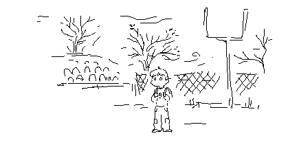
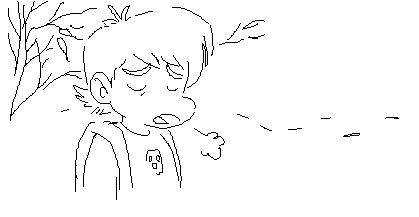
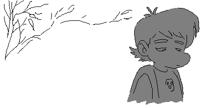
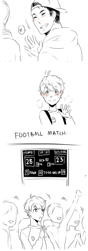
this is now a tumblr web comic, who knows when the next upate is, all we know is its gonna be fucking amazing when it happens
best thing ever
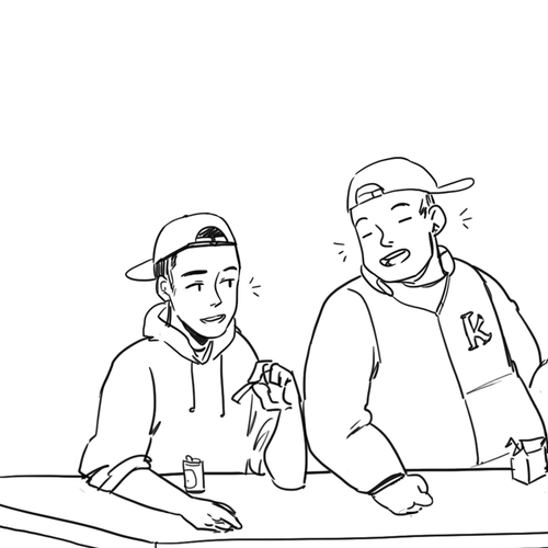
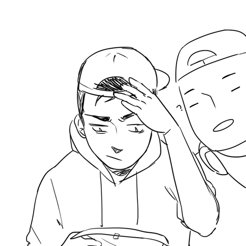
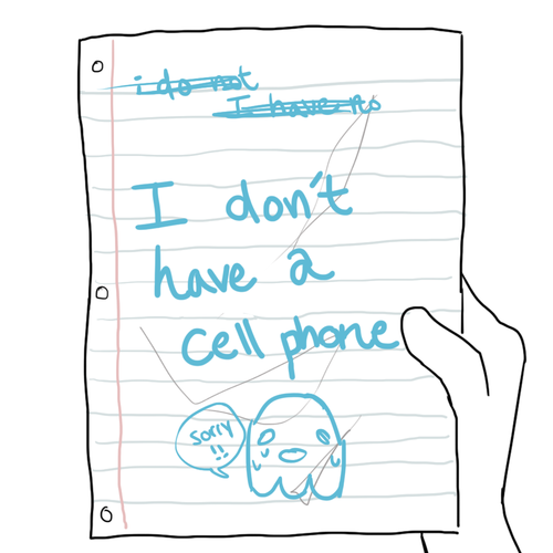
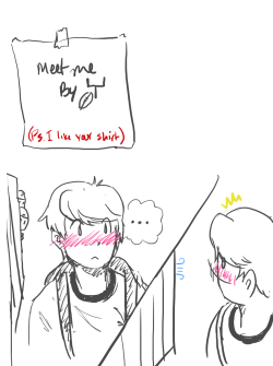
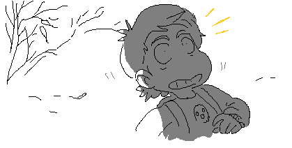
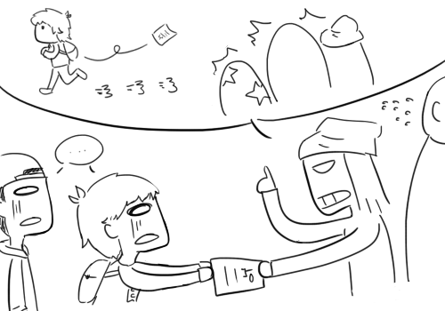
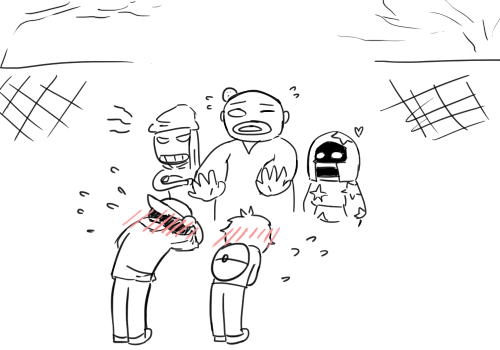
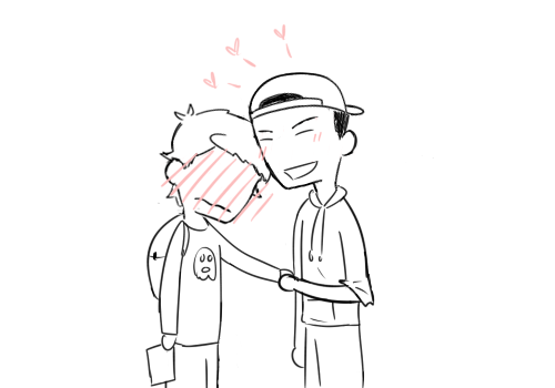
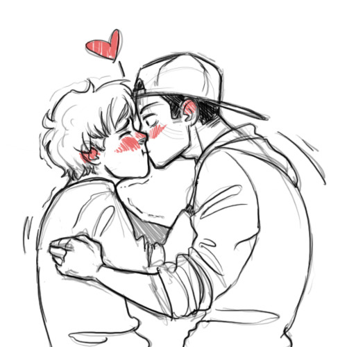
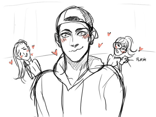
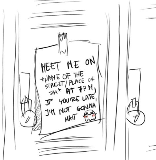
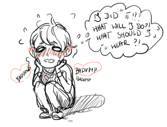
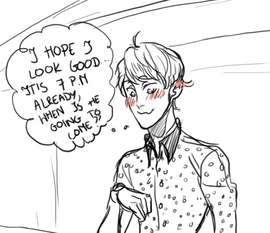
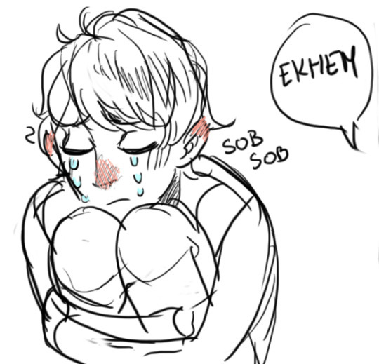
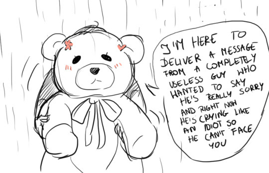
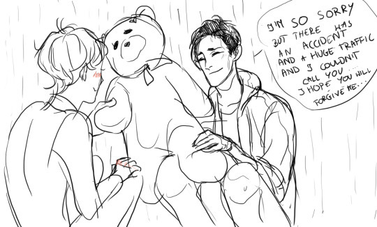
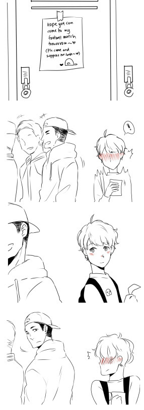
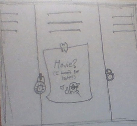
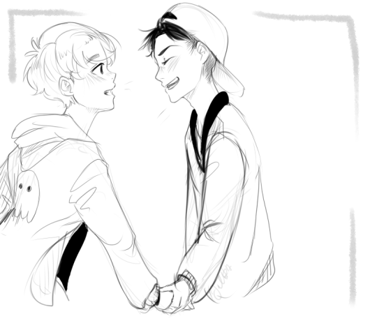
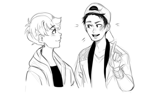
Traditional style (Sorry the picture quality is really bad) but here is my (super short) update!!
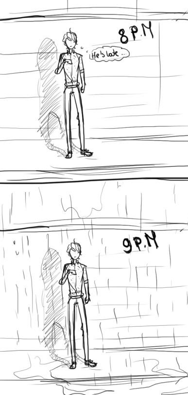
(The text says : Movie? I won’t be late!)
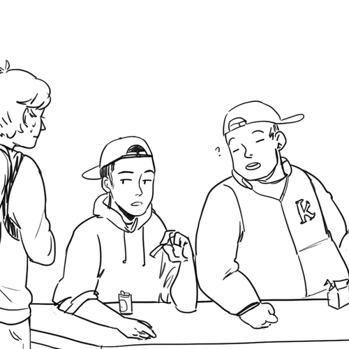
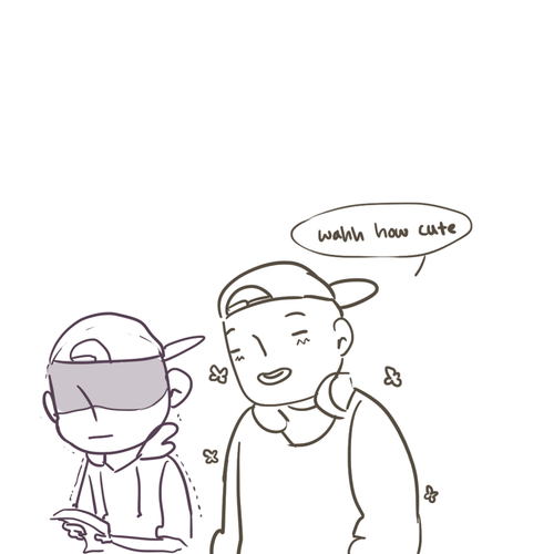
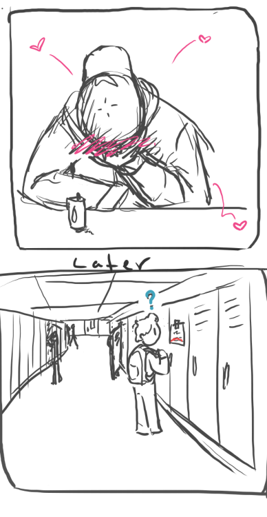
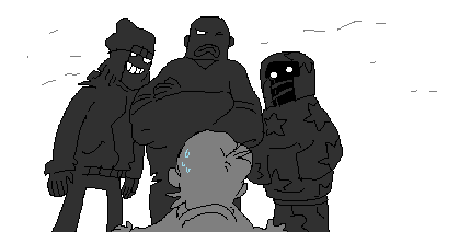
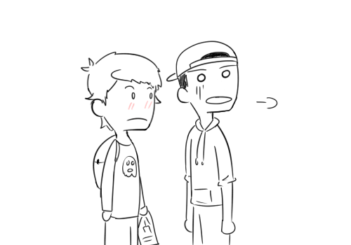
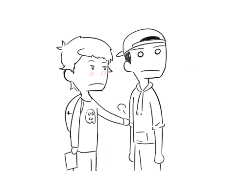
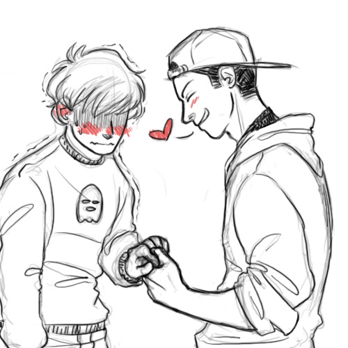
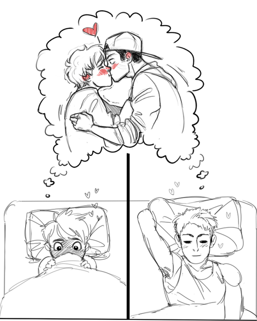
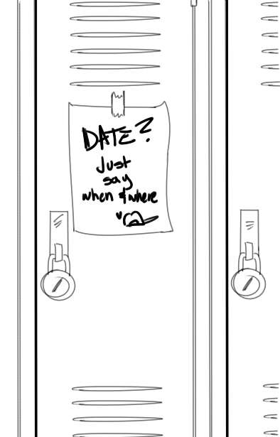
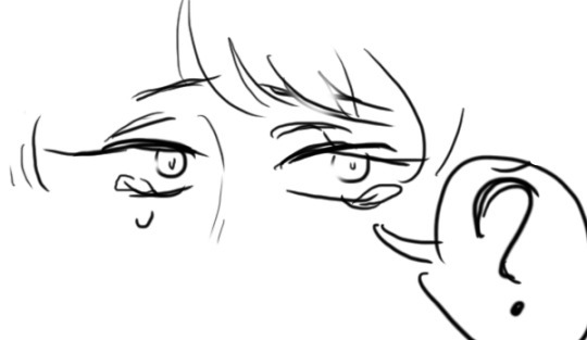
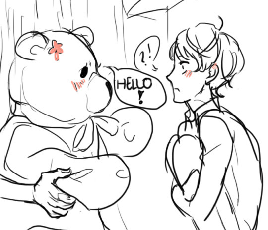
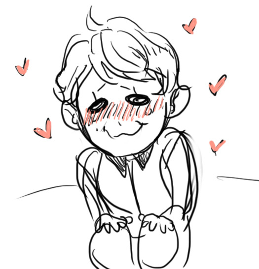
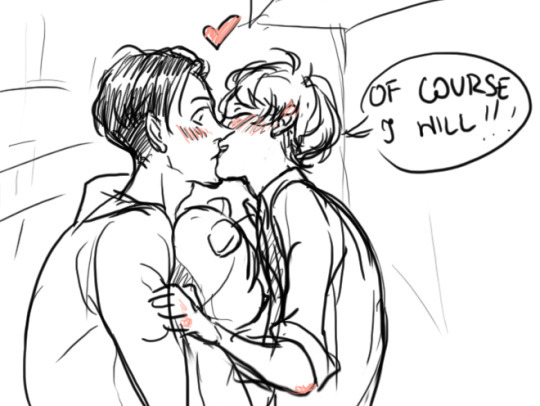
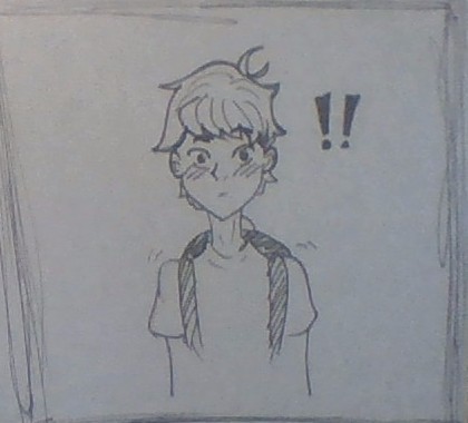
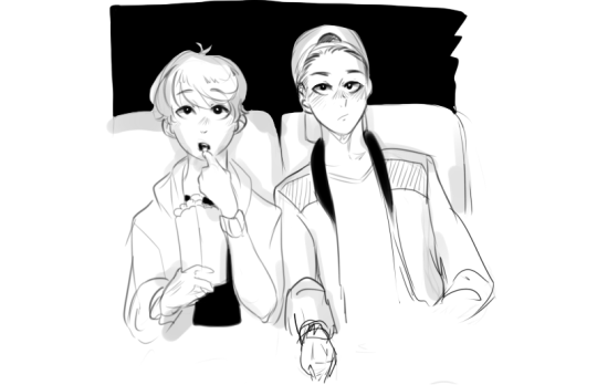
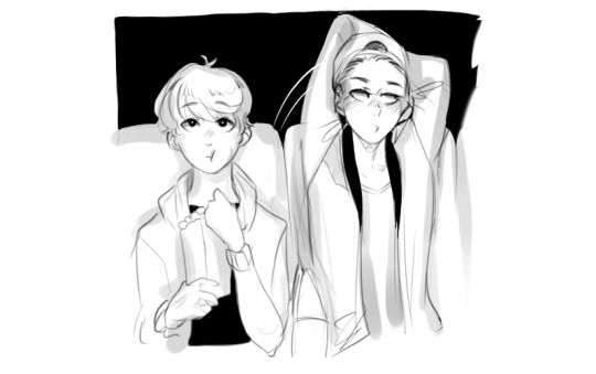
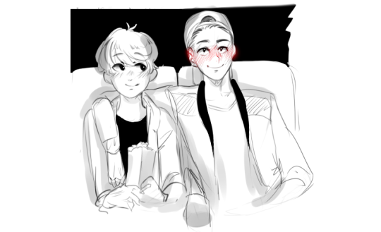
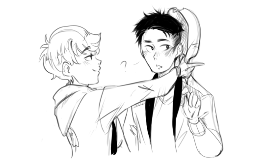
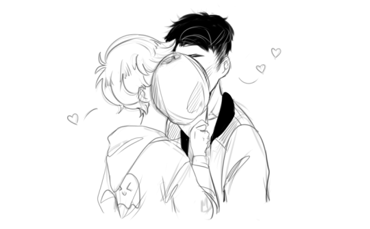
my contribution!
I rarely reblog long posts like this, but this particular collaborative comic thing has been around for /years/, like at least three or four, and it has an update every time I see it. It is a truly pure relic from a simpler time.
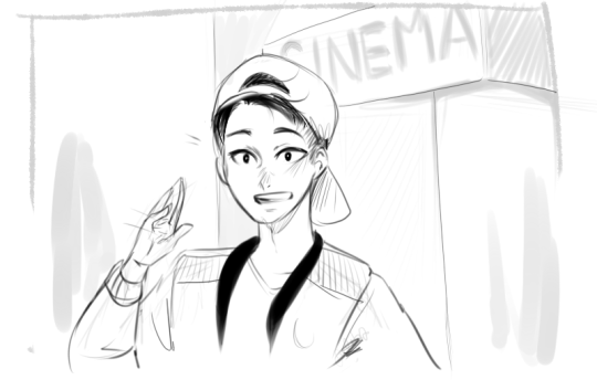
*screeching about how much more has been added since last year*