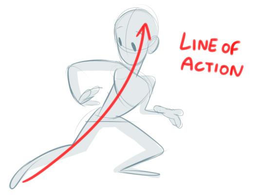
I guess three things I think of when it comes to poses are line of action, straight vs curved, and weight. I’ll use this quick awkward doodle to demonstrate:
You probably know this one if you know animation. Everything in the drawing doesn’t necessarily have to stick to it, but its a good basis for the overall silhouette. Most examples I’ve seen stick to one line, but sometimes I experiment with two if I’m going for a more action-y, dynamic pose. Its best not to go over two (two is risking it) as that would just get too visually confusing.
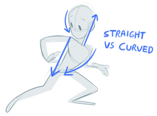
This one is more for smaller details, such as the arms and legs. Its good if you want to go for a more stylized look, since real life humans never have completely straight lines anywhere on their body. It’s basically contrasting a straight line with a curved one so you get a clearer idea of where the volume is going. Check out this video if you want more info, which is where I referenced from!
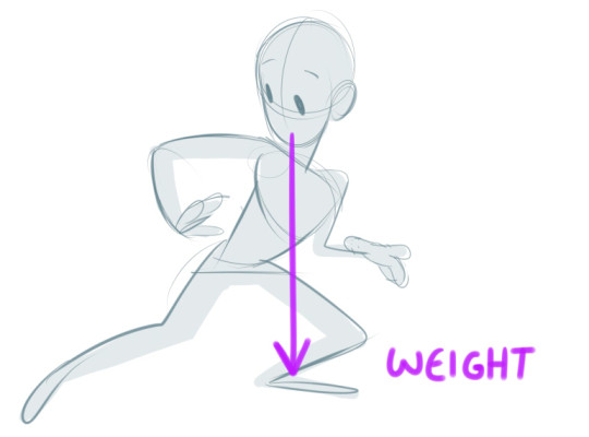
An easy one to forget in my experience. A little trick we learnt in life drawing class is that in real life the nose should generally be parallel to where the most weight is, to make it look more balanced. You’ll notice too that the body gets more compressed where the most weight is, ie the left leg here.
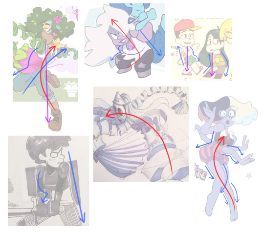
Some of my own (colour coded) examples, although I’m still learning to apply these things ~
(Sometimes if the nose doesn’t line up with where the body is leaning, you have to balance it out with the limbs or other body parts. The amethyst one would not work if she wasn’t holding another character on her back)
I recommend looking up these techniques online or in art books as you’re bound to find more in-depth tutorials and examples. But overall I hope this helps!